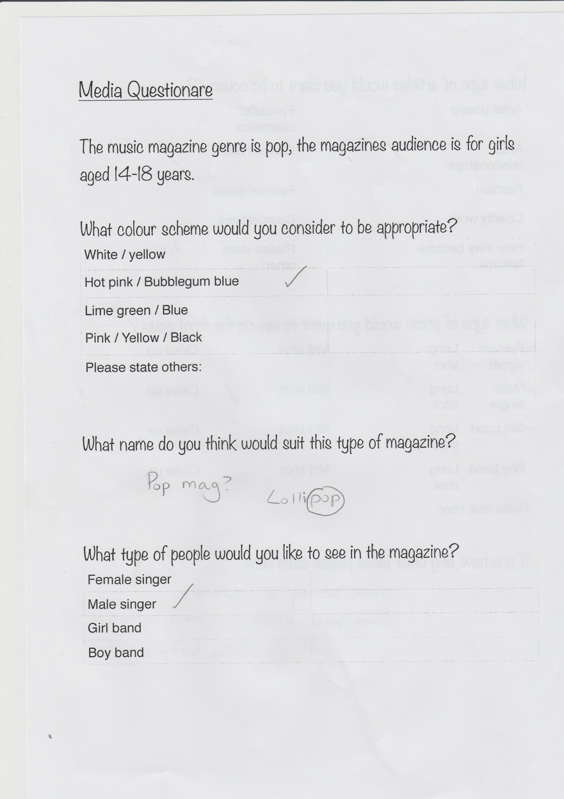
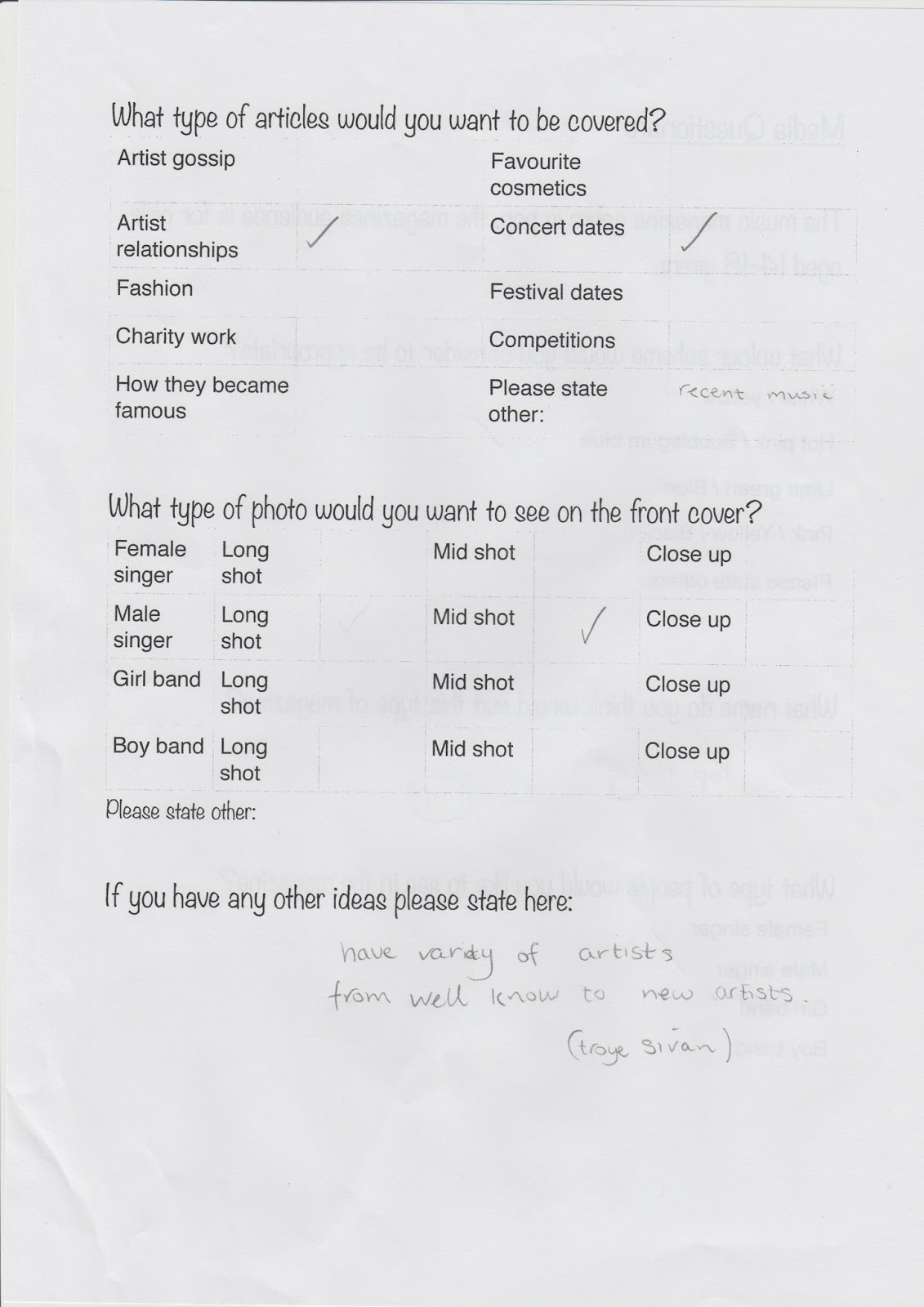
Tuesday 29 December 2015

Photo Edit

Photo edit:

Here is a couple of photos which I have edited. I will show the before and after of each edit.


 Here is the first photo (above) and here is the photo after I had edited it (below).


Here is another, here is the before (above) and here is the picture after being edited (below).

First Photo Edit

First photo edit:
Here is my first photo edit in Lightroom CC.

Monday 28 December 2015

Camera Angle Examples

Camera angles:
 Here is a keynote of camera angle examples:
http://www.slideshare.net/chloejane16/camera-angles-pdf


Binary Oppositions

Binary Oppositions:
Binary oppositions are found in many tv dramas and films. A binary opposition is two opposites which contrast each other, they are the complete opposite. 

These are some examples of Binary Oppositions:


Good vs Evil 
Men vs Woman
Hot vs Cold 
Poor vs Rich 
Black vs White
Low status vs High status
Pretty vs Ugly 
Low class vs High status
Short vs Tall 
Humans vs Nature

Photos

Photoshoot:

I am going to take photographs in front of a white sheet so this contrasts with the models, it will also make it easier to edit a background in if it needs one. I will use a good quality camera and I will use the flash to create a smooth sharp image.

How I am Going To Edit Photos

Editing Photos:

I am going to edit photos using Lightroom and Photoshop.
In these photo editing apps I will edit the person to make the picture look as smooth as possible. 
In some of these photos I will add a background to a once plain white background.

Sunday 27 December 2015

Female Hairstyle Ideas

Female hairstyle ideas:
Here are some female hairstyle ideas for my female singer. 

Here are some long hair hairstyle ideas.


Here are some mid length hairstyle ideas.

Older Female Singer Outfit Ideas

Older female singer outfit ideas:

Here are some outfit ideas for the older female singer, Leah.

The outfit ideas that I have chosen are going out formal outfits. Because this is what I Think a female singer would wear.

Friday 11 December 2015

Costume Ideas For Male Singers

Costume ideas for males:


Here are some examples of clothing ideas for the male singers. The top right hand corner picture is an example of casual clothing for male singers. The rest of the pictures are of formal but slightly casual wear. 

Friday 4 December 2015

Contents Page First Idea

Contents page first idea:

Here is my first idea of what my contents page will look like. This is a very basic plan for my contents page. This will also change dramatically overtime.


Front Page First Idea

First idea for front page:

Here is my first idea of what my front page will look like. This is a very basic plan. Overtime I will develop it.


Thursday 3 December 2015

Costume Ideas For Female Singer

Costume ideas:


 For my female character I will take pictures of her in casual wear and also formal wear.

For casual wear I am going to have her wearing a jumper, skinny jeans and casual trainers or boots. The jumper will be more like the example of the peachy-orange jumper to the right. Loose wearing and casual, showing she can wear casual clothing as well as just formal wear which she wears most as she has to look good for the press.

For the formal wear I will photograph her in party/ going out wear. This then giver her the edge of sophistication and looking smart. I will get the singer to wear something like the picture on the right, something with shorts. it will have two bold colours on. Something that will stand  out.

Wednesday 2 December 2015

Colour Triangles

Colour triangles:

Colour triangles are useful at directing the readers eye to certain points. This helps to get the audience to notice the magazine. Below are three magazines which I have analysed for the colour triangles. I have presented this on the application called Pages, then when I had finished I had screen shot them to upload the pictures to here.


I have analysed this magazine cover which has 2 colours in the colour scheme. The colours are yellow and white, these are calm, happy and mostly girly colours. One point on the mast head is yellow so that links with the number 4 which is also in yellow. It links with that the most because it is the largest. Another point connected is the article line which is at the bottom right hand corner. This puts a focus on Taylor's hair which is blonde and curly. 
The second colour was white one point is the top of the article lines, the other is the bottom where it has the large font. The third point is the singers name in the bottom right hand corner this makes a focus on her lips, this then makes the audience focus on her make up and admires her natural make up look.


This magazine also only has two colours for the cover scheme but has a very different design as the mast head is down the left hand side of the page. This is something that is quite different. The first colour is red. The first point is the red masthead. Then it links with the article line on the right hand side of the page. This then links with the red light which is brightly shinning on Justin's hair, making it look quite red. This puts an immediate focus on his face and lips. This happens as his lips are quite red and his face is the main part of this front cover, as he will be mentioned a lot in this magazine. The next colour is white. The points are his name which is in white, the small article line on the right, and the article line underneath his name. This puts a focus on his name and his neck and arms.

This magazine has 3 colours in its colour scheme. The yellow is linked with the masthead colour and the article title on the left and the article title in the small circle on the right. This focuses on her original dress which she is wearing. The white is linked with the article above the masthead. It is also linked with the article underneath Katy's name and in the article title in the small circle. This focuses on the flowers on her dress. The black colour is linked wither side of the masthead and her name. This puts focus on her face, showing ff her extravagant make up which she is wearing.

I will use the colour triangles to put focus on certain points on my front cover of my pop music magazine.

Masthead Colours

Masthead colours:

Here is a presentation of my masthead colours.

http://www.slideshare.net/chloejane16/masthead-colours-pdf

Codes and Conventions

Codes and conventions:

Main image: Usually this takes up the whole of the front cover. Sometimes it may cover up the masthead, sometimes not. 

Masthead: This is what the magazine is called. It is the brand and will usually have a unique font. It may fill the width of the page at the top. Or may only cover up a small section of the left hand corner.

Streamline: This is the subheading which is under, or above the masthead.

Splash: This is the main story of the front page along side a headline and, or a photo.

Secondary lead: A preview of an article which is inside the magazine.

Spread: This is an article which covers more than one page.

Puff: This is a phrase or word which which attracts the reader.

Date: This is usually the date which the magazine was issued.

Colour Scheme: This is a few colours which are used throughout the magazine. They usually match the genre of music.

Bar Code: This is usually placed at the bottom right hand side of the magazine front cover.

Photos Female

Photos practice - Female:

Here is my presentation from my photo shoot.


http://www.slideshare.net/chloejane16/photoshoot-presentation-pdf

Sunday 29 November 2015

Photo Ideas

Photo Ideas - Female

Here are some photo ideas of what my photos of my female singer will look like.

Some are mid-shots, close ups, long shots. There are also some which have the models hands to frame their face. The is the type of thing I will consider.


First Character Ideas

Character ideas

Here are some character ideas for my pop magazine called IDOL:


Female singer: Louise
She is 17 years old. She is a singer who has been popular since she was 12. She found her fame from singing in her home town. She sang in her home town since she was 7 and she found her fame from someone finally recording her and uploading it when she was 12.

Male singer: Brandon
He is 21 years old. He is a singer with his brother Mitchell. They both started singing from when they were young. Brandon and Mitchell were born into a family of performers, some were dancers, some were singers but their whole family are talented.

Male singer: Mitchell 
He is 18 years old. He is singer with his older brother. He started singing when he was young, the brothers performed with their family on stage when they put on shows around the UK.

People Who Publish Magazines

People who publish music magazines:


All types of magazines need publishers so they could help to bring the target audience, so they can sell their magazine.

One example is The Music Magazine Publishers Association (MMPA). This is a membership organisation which was established in 1996. This publishing association is for serving musicians and music enthusiasts. The MMPA has two main purposes which are to help encourage positive perceptions and the acceptance of musician-oriented magazines throughout all parts of the music products industry. It also is the most efficient, cost effective distribution of the sale of music magazines.

Another example is Rhinegold Publishing. It is one of the UK's leading publishers for music and performing arts. They produce specialist magazines, number directories, guides and many other topics.

Wednesday 25 November 2015

Font Types

Font types

Here are some different font types. The one which I think looks the best is the font Urban Jungle.
So I will use this font for my magazine name. This font is front: fontspace.com


Masthead Examples

Masthead Examples

 Here are some examples of mastheads that I found. These are from magazines that are being sold around the world.

These mastheads will give me an idea of what my masthead will be like. 

I will have to chose the font, colour and the placing. Whether to have it across the top or more to the side. I will have to decide this later on, maybe when I have took and have chosen a picture for my front cover.


Saturday 21 November 2015

Magazine Name

Magazine name: Final choice


All of the names that the people have given are really good names for pop magazines. Some names have play on words, some have a simple ring to them also some can be for any type of genre, they art really specific. However all the names given are really well thought of. 

However I have thought of a name for the magazine which is: Idol

I think this is a good name because it seems more grown up for teenagers rather than have a childish name, also many girls look up to pop stars. For most teenagers pop stars are their idols so the name links well with that.

Here are the names that I received from people who answered the questionnaire:


So for my magazine the name will be IDOL.

Questionnaire Results Total

Questionnaire results: Total

After I added the results up collectively in the years and now I have added them up as overall results. I can now chose the things to add in. 

This is my slide show presentation of my results:


http://www.slideshare.net/chloejane16/questionnaire-results-power-point-copy

Also here are some examples of the results I received:


Tuesday 17 November 2015

Questionnaire Results Year 12

Questionnaire results: Year 12


I asked a few of the girls in my media class to do my questionnaire. I then added all the results and came up with a year 12 results sheet.

A very interesting point they have said is to include free items, because some people like free items in magazine more than magazines that don't include free items. Sometimes people are more inclined to buy them. Also another good point is to include a poster, because some artists have posters and some don't and its hard to find some, so this will also help sell the magazine.

Here are the year 12 results: